Art evokes feeling – in our offices, we want to be inspired. In our living rooms and bedrooms, we want to feel relaxed. In the entrances to our homes, we want to show who we are.
But let’s be real, art can be expensive and most of my clients aren’t interested in being investors in an art collection – they just want their spaces to feel finished and reflective of themselves, their interests, and their families.
Clients often ask me for help with art and it’s sometimes one of the more tricky parts of design. The reason why it can be so tricky boils down to a few factors:
Scale matters – it’s often difficult or overwhelming to find the right piece, that you truly love, in the right size.
Many of my clients don’t really know what they like, but don’t like a lot of what they see in stores.
Where does it go? Does every wall need to have art?
Even reading those factors probably brought up even more questions if you’ve been considering hanging art in your home. Here are some tips and tricks when it comes to choosing and hanging art in your home.
MOST of the time…. Bigger is better.
This is how I get the most bang for the art buck.
We don’t need to plaster every wall with coordinated pieces if you have one appropriate but larger piece that makes you feel how you want to feel in that space. Sometimes bigger doesn’t even mean in size – sometimes it’s bolder.
One of the most memorable front entries that I’ve ever visited in a home had a perfectly oversized original piece of art by Alberta artist Jason Carter. It was a lone wolf on a red background and, I can’t emphasize this enough: It was perfect.
It was so bold but by itself, it wasn’t too much. The other walls in that smaller space were left empty and that was perfect too. I already had something incredible to look at and didn’t need more.
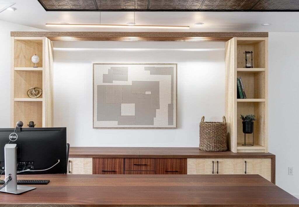
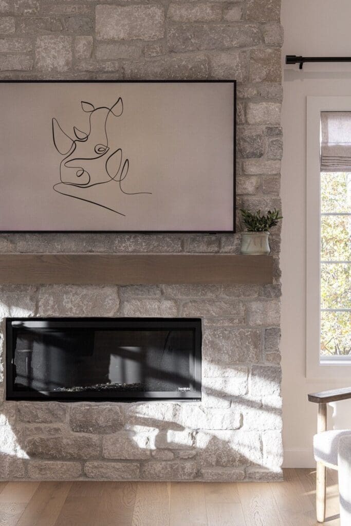
One of the most common mistakes I see when people are choosing wall art is actually choosing pieces that are too small. A small piece floating above a large sofa, bed, console or fireplace can make the entire wall feel unfinished – even if the art itself is beautiful.
As a general guideline, when hanging art above a piece of furniture, I like the art (or grouping of art) to take up somewhere around two-thirds of the width of the furniture below it. It doesn’t have to be exact – design rules rarely do – but it’s a good starting point.
If you’re debating between two sizes, I will very often tell you to go bigger.
Choose art you actually love.
This is the hardest part about choosing art for my clients – it’s so hard to nail what’s going to give that “Ohhhhh. Yesssss.” reaction, so it often takes a few rounds of refinements and that’s ok.
If it means that we leave that wall bare for a bit, that’s just fine.
There is no rule that says your home needs to be completely decorated six weeks after you move in. In fact, some of the most interesting homes are the ones that have evolved over time.
Art is personal. It doesn’t necessarily need to coordinate perfectly with your sofa. It doesn’t need to contain the exact shade of green that’s in your throw pillows. And it definitely doesn’t need to match the art hanging in the next room.
I would much rather see something that tells me something about the people who live in the house.
Maybe it’s an original painting you found while travelling. Maybe it’s a photograph of somewhere meaningful to your family. Maybe it’s a $40 vintage print you found at an antique store. Or maybe it’s something your kid made at school that looks surprisingly amazing in a really good frame.
If you love it, we can probably find a way to make it work.
Your art doesn’t need to “match” your room.
This is one I get asked about a lot.
Should the art match the rug? Should it pick up the colour of the sofa? What if there’s blue in the painting and there isn’t any blue anywhere else in the room?
It’s fine. Actually, it can be better than fine.
Art can be an opportunity to introduce something unexpected into a room. If every single element in a space is perfectly coordinated, the room can start to feel a little too designed.
That doesn’t mean we completely ignore the rest of the room. There still needs to be some relationship between the art and the space around it. That relationship might come from colour, but it could just as easily come from mood, style, subject matter or even the frame.
A very traditional oil painting can look incredible in a contemporary room. A modern abstract piece can be exactly what a more traditional room needs.
Sometimes the contrast is what makes it interesting.
Not every wall needs art.
I repeat: not every wall needs art.
Empty space is part of design.
When I’m working on a room, I’m always thinking about where I want your eye to go. If there is something on every wall, every shelf and every surface, suddenly nothing is particularly important.
Think about the room as a whole rather than evaluating every blank wall individually.
Maybe the fireplace is the focal point of the living room and has a beautiful piece of art above it. The wall beside it might not need anything.
Maybe there’s a large piece above your sofa. The opposite wall could have a console, mirror or interesting light fixture instead.
Leaving some walls empty gives the pieces you do choose more impact.
And, as a bonus, it also means you don’t have to buy as much stuff.
What size art should you choose?
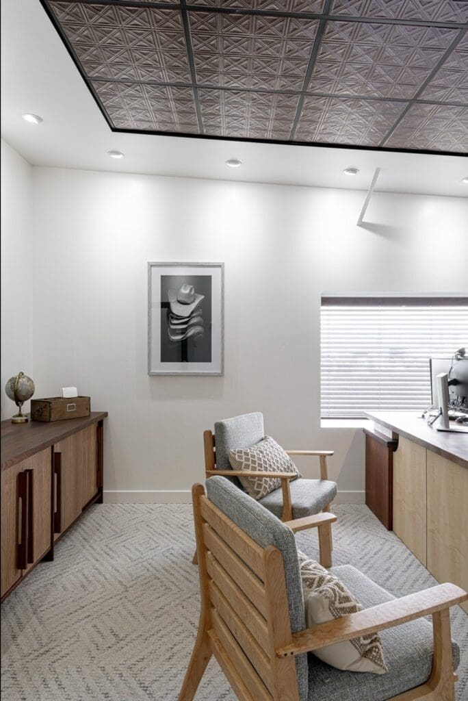
If you’re choosing art for above a sofa, bed, sideboard or console table, start by looking at the furniture underneath it rather than the wall itself.
As I mentioned earlier, somewhere around two-thirds of the width of the furniture is usually a good starting point.
For example, if you have an 84-inch sofa, a 24-inch-wide piece of art is probably going to look lost above it. Something closer to 50–60 inches wide – whether that’s one piece or a grouping – will usually feel much more intentional.
The same applies over a bed. A tiny picture centred over a king-size headboard is going to look…tiny.
You can achieve that larger scale with one oversized piece, two coordinating pieces, a triptych or a gallery wall.
The important thing is that the overall composition feels substantial enough for what is below it.
How high should you hang art?
Another very common mistake: hanging art too high.
Art should feel connected to the furniture and the people in the room – not like it’s trying to escape toward the ceiling.
For art hanging on an open wall, a common guideline is to position the centre of the artwork around 57–60 inches from the floor. Think roughly eye level rather than automatically centring it vertically on the wall.
When you’re hanging art above furniture, though, I pay more attention to the relationship between the two.
Above a sofa, headboard or console, somewhere around 6–10 inches between the furniture and the bottom of the art will often look right.
But again – these are guidelines.
Step back and look at it.
Does the art feel like it’s connected to the furniture underneath it? Or does it look like it’s floating somewhere above it?
Trust your eye.
Gallery walls: yes, but…
I love a good gallery wall.
I do not love a gallery wall created because someone has a giant blank wall and panicked.
A gallery wall should feel collected rather than like you bought a box labelled “gallery wall set.”
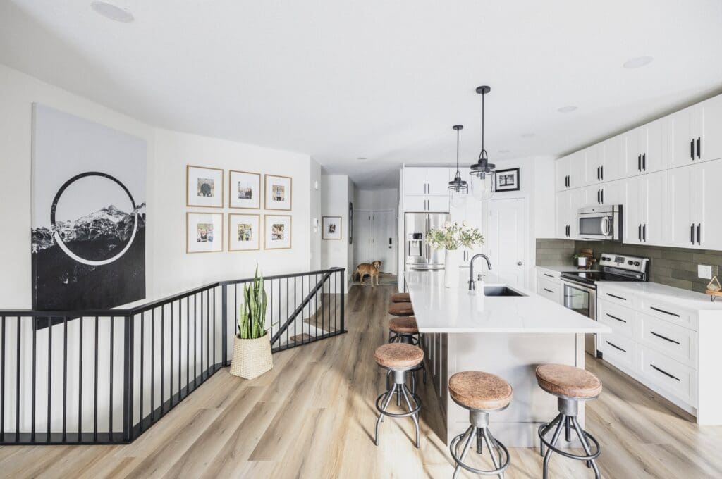
Family photographs are an obvious choice, but gallery walls can also combine original art, inexpensive prints, photography, kids’ artwork, vintage pieces and even small objects.
Frames don’t necessarily need to match either.
For a cleaner look, keep the frames consistent. For something more collected and relaxed, mix wood, black, brass and vintage frames while keeping another element – perhaps the colour palette or subject matter – somewhat consistent.
Before putting 17 holes in your drywall, lay everything out on the floor.
Move things around.
Take a picture.
Move them around again.
And then start putting holes in the wall.
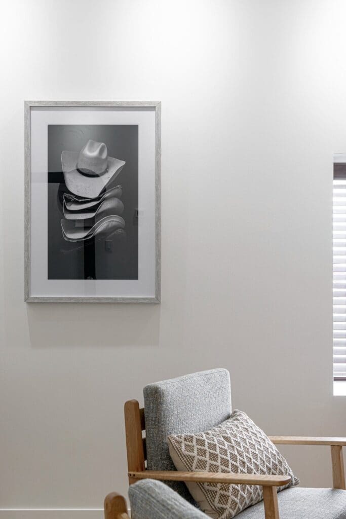
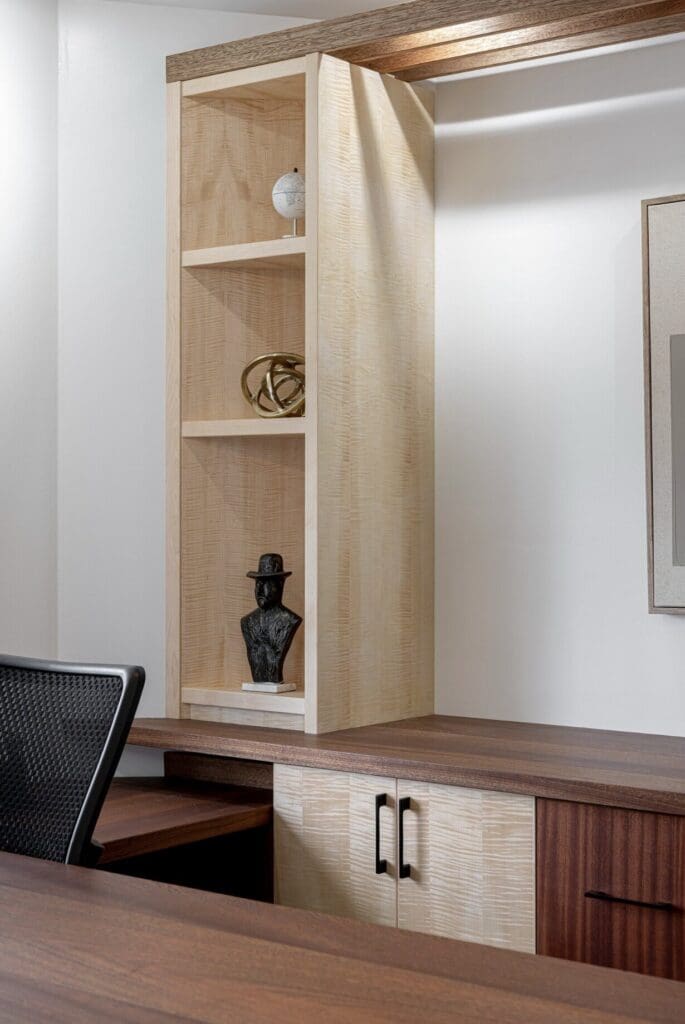
Original art isn’t your only option.
I love original art. I love supporting local artists, and I think original artwork can add something incredibly special to a home.
But not every piece in your home needs to be original.
There are so many ways to incorporate affordable art into a home: limited-edition prints, downloadable artwork, vintage paintings, photography, framed textiles and even beautiful pages from old books.
One of my favourite tricks is to spend money on the frame.
An inexpensive print in a beautiful oversized mat and quality frame can look far more expensive than it actually was.
On the flip side, an incredible piece of art in the wrong frame can lose some of its impact.
Framing is part of the finished product.
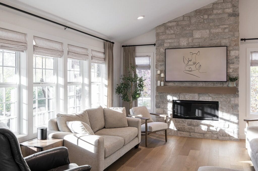
Think about how you want the room to feel.
Remember where we started? Art evokes feeling.
Before you start searching for art for your living room or bedroom, ask yourself how you want that room to feel.
Do you want your bedroom to feel calm and quiet? You might gravitate toward landscapes, soft abstracts, photography or pieces with a more muted palette.
Do you want your powder room to have a little personality? Go weird. It’s a powder room. This is exactly where you can hang the strange vintage portrait that makes you laugh every time you see it.
Your office might need something energizing. Your front entrance might be the place for something bold. Your family room might be the perfect place for something personal.
Instead of asking, “What art goes with this room?” try asking:
“How do I want to feel when I’m in this room?”
That question is usually much more helpful.
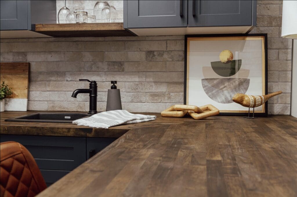
And finally…give it time.
You don’t have to fill every wall immediately.
When we finish a design project, there are sometimes spaces where we know exactly what belongs on the wall. Other times, we wait.
And waiting is better than buying something you don’t really like just because the wall is empty.
Keep your eyes open when you travel. Visit local galleries and art walks. Look at vintage shops. Pay attention to the things you save online. Frame something meaningful. Buy the weird little painting you can’t stop thinking about.
Over time, you’ll start to notice what you’re drawn to.
And when you find the piece that gives you that “Ohhhhh. Yesssss.” feeling?


